The question that started it
I work in Siemens Energy's condition-monitoring business, and one strategic question kept coming back in different forms: where will electricity demand grow next?
Data centers and water infrastructure are the strongest forward signals for that question, and the public data describing them does exist. The problem is not that the data is secret. It is that it is scattered across dozens of disconnected sources, which means answering the question turns into a research project every single time somebody asks it.
What I decided to build
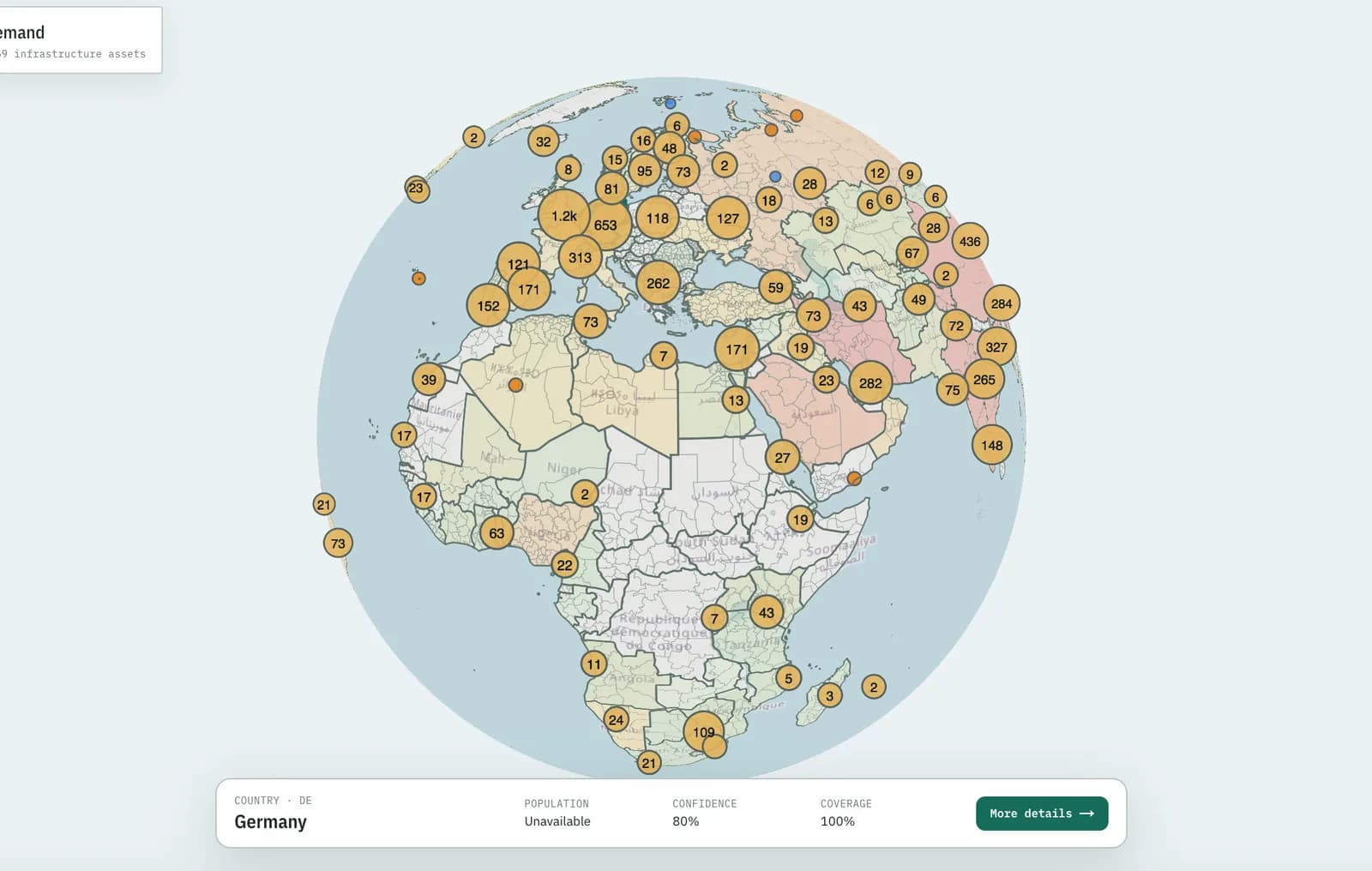
Rather than answering it again, I built the tool I wished existed: one interactive global map showing where data-center and water-infrastructure growth may create electricity demand, opportunity, or risk from 2026 to 2031.
Deliberately a live surface rather than a report. A report is out of date the week it ships. A map that refreshes itself stays useful.
How it works
Ingestion. Python data pipelines pull, validate, and score data from more than 100 public feeds, through APIs and webhooks. Validation and scoring matter more than raw volume here, because public infrastructure data is inconsistent, and a map that shows a badly sourced facility next to a well sourced one without distinguishing them is worse than no map at all.
Coverage. 3,000+ regions across 197 countries, 4,300+ demand facilities, and 53,000+ power generators.
Refresh. An automated pipeline refreshes the data daily, so the map is a standing answer rather than a snapshot of the day it was built.
Front end. Next.js, with a clustered map, regional drill-downs, and full source provenance for every facility. Provenance is the feature that makes it usable in a commercial conversation: you can click from any claim through to where the claim came from.
Built with agentic AI coding tools
I built Wattlas with agentic AI coding tools and deployed it via GitHub to Vercel. That is the honest description of how a one-person data product of this size gets built alongside a job. The tools did not remove the need to make the data-model, validation, and interface decisions. They removed the reason not to start.
The Wattlas app itself is public and free to use. Its source repository is private, so this is not an open-source project.
Where it landed
Colleagues at Siemens Energy now use it regularly, after I demoed it in meetings. A commercial question from my day job turned into a shipped, live data product.
That loop is the point of the whole thing: notice a question the organization keeps re-answering by hand, then build the artifact that answers it once and keeps answering it.